deviant art

Deviant Login Shop  Join deviantART for FREE Take the Tour
[x]
Shop Similar Prints
This Print Not Available
Download Image
JPG, 1422×1828
more ▶

More from *ChuckWalton

Featured in Groups:

Details

September 3, 2012
1.8 MB
1422×1828
Sta.sh
Link
Thumb

Statistics

Comments: 115
Favourites: 1,323 [who?]

Views: 18,459 (4 today)
Downloads: 331 (0 today)
[x]
:iconchuckwalton:
DOUBLE CLICK FOR BEST RESULTS!!!

Hey DA and Splicehead Family!

Well, the cat is out of the bag, sort of speak. I was just asked by a fellow poster on the Palladiumbooks forums named Pepsi Jedi if a print seen on the left side of the picture taken at Gen Con 2012 was mine

[link]

…and, yes by all means it is. Great eyes Pepsi Jedi!

It is the upcoming cover for one of the 2013 SPLICERS sourcebooks. Actually this illustration has been completed a year or two ago. Just goes to show that not everything going on behind the scenes is revealed.

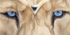
The painting entails a Splicers bio-armored Outrider squadron leader, riding a new Panthera styled (clouded leopard, jaguar, etc.) War Mount engaged in deadly combat against a new machine that has been hunting them on the outskirts of a ruined city (or is it vice versa as they both are hunters)?

I will eventually post the tutorial step-by-step process I did to paint this illustration. The Illustration was penciled on 11 X 17 and then digitally painted in PS3, total hrs. estimated: Unknown as I worked off and on this illoe. I chose to utilize the Clouded leopard for both its aesthetics and to increase awareness of it as a species to help promote conservation for this endangered species.

I look forward to your comments on this illoe.

The SPLICE MUST FLOW!
Add a Comment:
 

Daily Deviation

Given 2012-09-21
:iconslavetotrends:

MAIN CRITIQUE
I don't know where this idea came from, but you've captured it well. You've got marvelously designed characters, fantastic atmosphere & lighting, and an overall spectacularly detailed fight scene. Other than the big cat, I have to say, "Omega 16" caught my eye. A very interesting and powerful war machine that seems to have every weapon imaginable on it. I've seen others like this, but not as well designed.


OPINIONATED STUFF
The only two things that I think should be considered are the following:

-The spots on the cat could be redone, as the black doesn't seem to mix with the orange/white fur - it seems to blend sloppily. Mainly around the neck area.

-In a fight scene, [I personally feel] it's best to have all of the wanted subjects and objects within the picture completely, as opposed to cut off. The subject I speak of is the one at the lower right. It seems like it would work much more nicely if you widened the picture just a bit.
What do you think?
The Artist thought this was FAIR
4 out of 4 deviants thought this was fair.

:iconsiegeonthorstadt:
Different people see different things when they look into a drawing. Some of them see the objects in the drawing trough a veil of symbolism, some see whats printed on the paper as a final result and some retrace the drawing process as they study the objects. What makes this work work fairly unique is that it hosts all of these types of views on the same page.

When I look at it, I feel the amazement of a poster fan as he would look at the leopard, a storytellers inspiration when he would try to figure out where the robot starts and where the cat ends, and an artist as he would try to redraw the clear mechanic/anatomic details of the attacker robot in his mind. The general environment connects these elements together while they're sitting there separately, without infiltrating into each others areas. One could even suggest that the main objects were designed trough different time lapses by the artist but that only points out to the fact that it took a certain amount of time to design and finish the drawing, which shows nothing but the work that has been put into it.

The contrast of the coloring doesn't disturb the general flow of the picture. While the leopard is contradicting the futuristic mood, it manages to fit in perfectly on the technical terms, as it has a shade of blue in its yellow colour, even though this is usually difficult for artists to work out since its a psychological challenge because the two colours are each others opposite. Here it was managed perfectly.

The general mood sets the viewer into a futuristic mood but puts us into an inspirational query in a way as it slides from the post-apocalyptic desertedness into a nano/bio technology based far future. Its difficult to find elements from the classics of these topics in this picture which gives it an air of originality.

The action was maintained well in the picture with the mobility of the attacker and it gets deeper as the viewer keeps looking at the picture, with all the small details like the rockets/shuttles flying in the background and the trailing of bullets on the ground, with the grappling tripod being in an engagement with the teeth of the cat. These are things that makes a viewer feel respected as it shouts that the artist didn't just draw a few objects in the front to impress the audience and be done with it. These small things, when one finishes discovering them all, make up a story in the picture which gives it a fulfilling feeling. These are typical qualities of a comic drawer, although I'm not sure if that's where the area of expertise of the artists lays at.

The lightening was maintained pretty good, the "glow" effects are not overdone nor neglected with their reflection to the environment. How the tiny light sources that wouldn't be faded with the light level are presented is very good, especially on a drawing like this that has a traditional art base.

The perspective drawing of the attacker is also another point to praise.

There are, of course, negative parts to the drawing as well, though not a result of neglect but maybe result of overworking on objects that make up the general actor. The picture is settled, worked with dedication on it, and thus it hinders the mobility of the scene. Although this is not very visible as the fullness of the details flood into the eyes of the viewer in the first look and makes up with due to its general "poster view". These overworked details make this picture unique, and like I said, are original.

Another thing is the lack of redrawability of the picture that could throw back a certain type of viewers that are looking for comic elements in such mobile/action drawings. When one looks at the actors he cant think them being heroes in continued comic box scenes, appearing again and again. This gives the picture a linear feeling, as its difficult to imagine the details for example, that sit behind the objects. This makes the drawing not as a sketch from a comic story, but more like the result of these scenes and the heroes artistic representations, which I believe, was the main objective. Which is not a bad thing.

Also the latin reference on the attacker might throw a shadow on its knightly image. One is mythological and the other classical. Since the in-between of these time periods is not known by many people and the modern literature, such detail an eye would see only with its blind spot makes a contradicting image in the subconscious. Although nobody pays attention to such things.

Generally, the creativity and the originality is amazing. This, united with the artistic skills put into the picture with praise deserving work makes up a great and enjoyable picture.

I usually never criticize art. It's not because I believe that even a stick figure has a fan, but because I believe art to be a process and not a result. The process can define art in any form regardless of the outcome. Commenting on a process is, in my opinion, with an article which aims to define its own result is not only useless but also very arrogant. But that's what I did now anyway :p
What do you think?
The Artist thought this was FAIR
4 out of 4 deviants thought this was fair.

The Artist has requested Critique on this Artwork

Please sign up or login to post a critique.

love 1 1 joy 3 3 wow 5 5 mad 0 0 sad 0 0 fear 0 0 neutral 0 0
:icondark-oak-trails:
*Dark-Oak-Trails Mar 10, 2013  Hobbyist Digital Artist
Featured here: [link] :heart:
:happybounce:
Reply
:iconscorpio81:
~scorpio81 Feb 23, 2013  Hobbyist General Artist
"wow"!!! (jaw dropped)
Reply
:iconmattermore:
SlaveToTrends -I don't write critiques, but... there is no character in the bottom right, that is part of the larger character in the entire right side of the image (so both characters are entirely shown), the size likewise is restricted to fit the confines of the cover the artist is creating this piece for. Otherwise I agree with most of what you say, only I don't see the blending as sloppy as much as confused, but any a color artist can say after working on something as insanely details as the stuff Chuck does can tell you I have no doubt...his work is crazy detailed! Its hard not to get a bit confused your eyes can only take in so much detail at once. Chuck just happens to overload our senses on the details, but in a much appreciated way. I just felt like commenting on the critique.
-Also this is amazing stuff and a solid collaboration you guys knocked it out of the park, really fantastic cover!
Reply
:iconpepsijedi:
Still love that one.
Reply
:iconmattermore:
Awe-inspiring, very much sums it up!

(Hey just wondering if you've had time to work on the POH commissions yet?)
Reply
:iconmangasockattack:
=mangasockattack Oct 11, 2012  Hobbyist Digital Artist
Very cool~
Reply
:iconiamrhaza3617:
Mood: Amazed *iamrhaza3617 Sep 24, 2012  Hobbyist General Artist
THAT IS TOTALLY WICKED! INCREDIBLE!
Reply
:iconasemharun:
~asemharun Sep 24, 2012  Hobbyist General Artist
Great work
Reply
:iconangie-pictures:
Awesome work! Congratulations on the DD! :iconflowerheartplz:
Reply
Add a Comment: